This is the first draft for my CD Digipak, the two spaces where the CD and the DVD which will feature my music video will be included into the two white spaces and will have a black background on the Left side and a plain white background on the right. The song list, including 10 songs which have been remixed to fit in with the one I have already done, will feature on the back cover and is yet to be done.
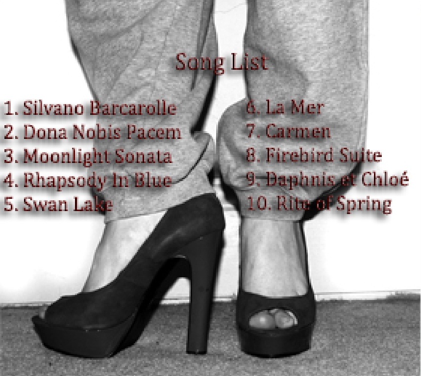
This is the second draft for my CD Digipak, this is more of a progression from the last draft than a new draft. This updated version includes text and the names of the song titles I want to include on my finished product. the text itself will change, concerning the font, size, colour and style. Also, the two spaces where the CD and DVD will be placed will not be left blank, soon it will have a black backdrop with spashes of bright white cast onto it to give it an artistic and graffiti style. The photographs |I have taken are used to illustrate the style of the music and appeal to the target audience, the reason I have chosen to get a formal looking dress with muddy walking boots is to show the coming together of two completely different styles which symbolises the music, as the music brings together the old style of music (orchestral etc) and remixes it to bring it into modern urban culture. this is then repeated through the second photograph, with joggers and high heels, and againb in the inverted photographs which symbolise that even when inverted (turned into it's opposite) the photograph still remains the same or at least still has an artistic quality. I also, need to design the colour and writing of the spine as well as the placement of the album name 'Obsession'.

This is the third draft for the CD Digipak which, again, is more of a progression from the last draft than a new one. The photographs have remained the same but I have made some big differences between the other drafts and the new one, for example the font on the text has changed dramatically making it easier to read and more appealing. Also, I have made a background for the CD and DVD holders of a pure black backdrop with wisps of white across it. To achieve this image I copied and image of ink in water from Google images and then edited it in Photoshop to create an inverted and pure black and white image. I have also created a simple black spine with the album name written in white letters 'Originality' to emphasize the point that the album does not need to use bright colours or massive letters to get itself know, originality and simplicity is best.
Close up of DVD/ CD background image
Close up of song list
Spine image


No comments:
Post a Comment